Data Science & Insights
COVID-19 Global & Regional Surveillance Dashboard (2020)
This two-part analytical dashboard provides a macro-to-micro view of the COVID-19 pandemic. It utilizes data from early to mid-2020 to track infection trajectories, mortality rates, and recovery benchmarks, contrasting global figures against a focused study of the Southeast Asian (SEA) landscape.
Technical Features & Insights
- 1. Global Impact Analysis
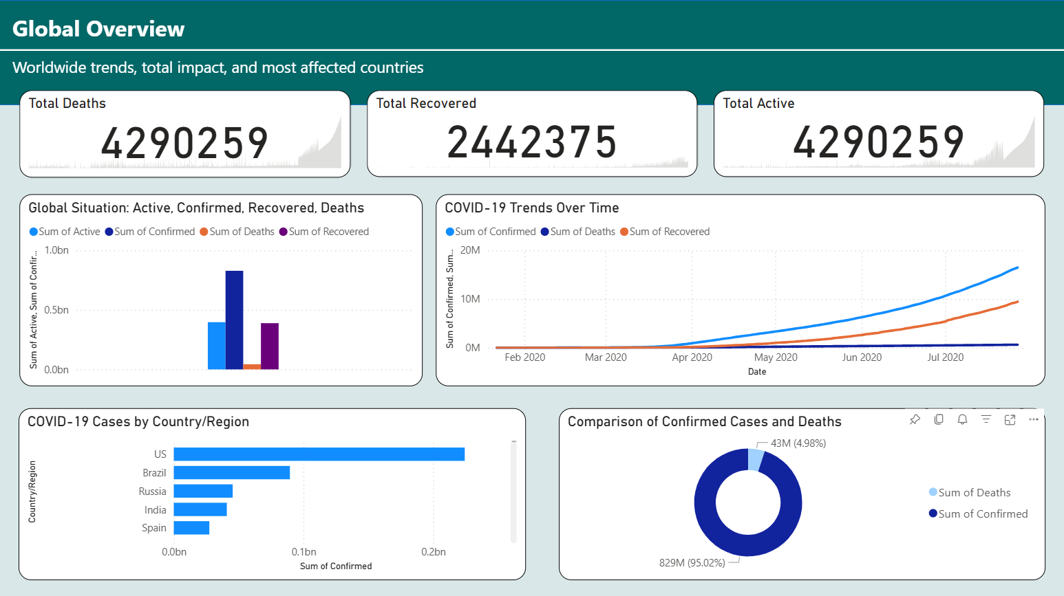
- The "Global Overview" tab establishes the immense scale of the pandemic's initial surge.
- Massive Scale Integration: Manages and visualizes datasets involving over 4.2 million active cases and deaths, demonstrating proficiency in handling high-volume epidemiological data.
- Mortality Modeling: Features a precision donut chart showing a 4.98% Case Fatality Rate (CFR) globally, providing a critical benchmark for clinical severity.
- Epidemiological Epicenters: Through ranked horizontal bar charts, the dashboard identifies the US, Brazil, and Russia as the highest-burden regions during the mid-2020 window.
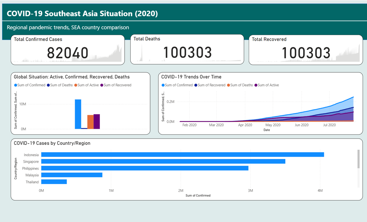
- 2. Regional Specialization: Southeast Asia (SEA) Focus
- The second dashboard shifts to a more localized regional analysis, crucial for understanding localized public health responses.
- Comparative Trajectories: Contrasts the specific growth curves of Indonesia, Singapore, and the Philippines, revealing Indonesia as the primary hotspot in the region during this period.
- Trend Synchronization: The "Trends Over Time" area chart highlights a distinct regional "inflection point" in April 2020, where confirmed cases began an aggressive upward climb compared to the flatter trends seen in early Q1.
- Data Discrepancy Awareness: Demonstrates attention to detail by tracking the relationship between confirmed cases and recoveries within the SEA context, identifying regional variations in recovery reporting.